
Solution
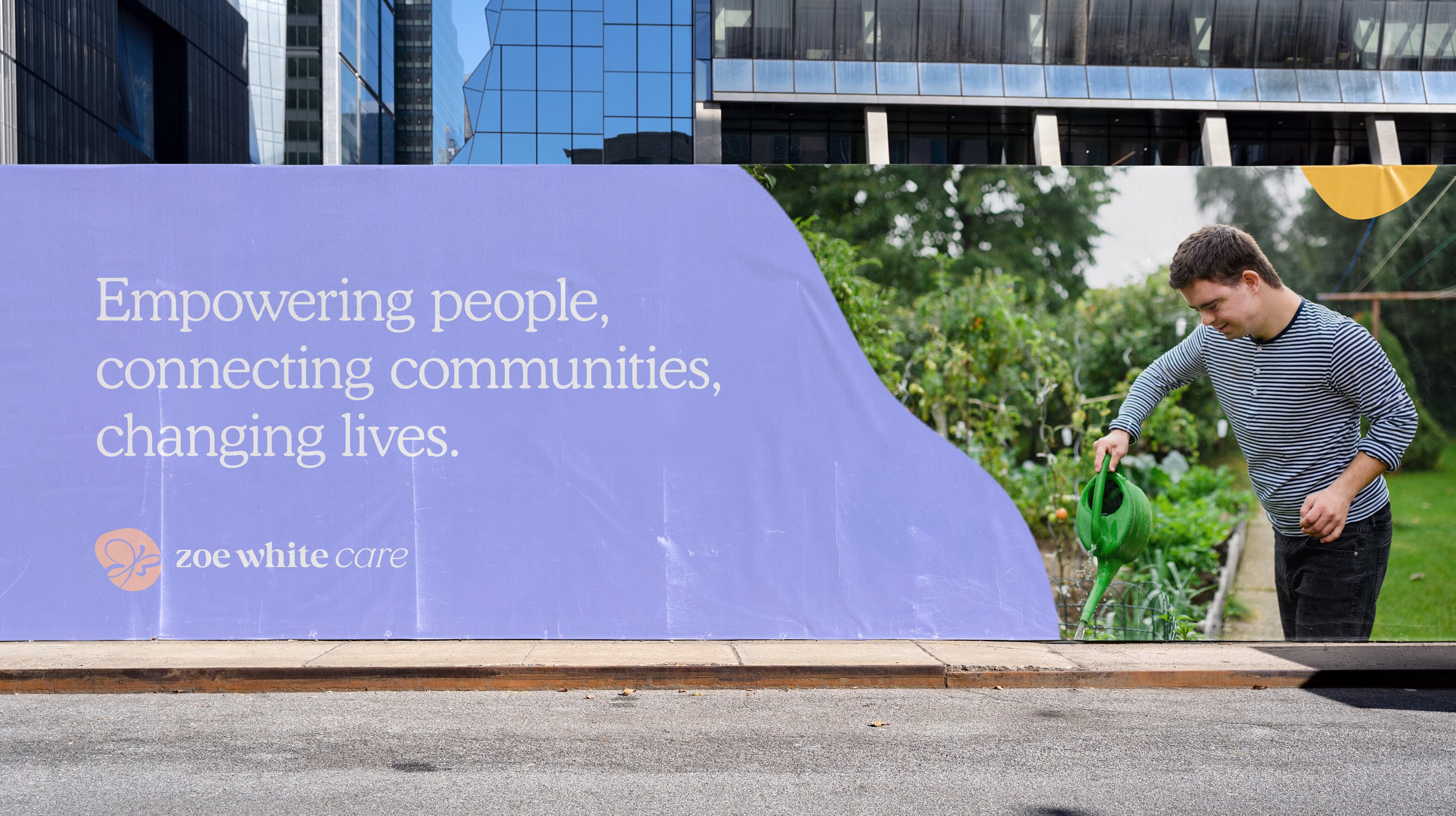
SOAK began with understanding the story behind the brand and how it came to be and what the values of the business were. From this, we were able to determine what they wanted to achieve and assess what their future goals were. This assisted us in being able to develop a visual identity and brand messaging that felt unique.
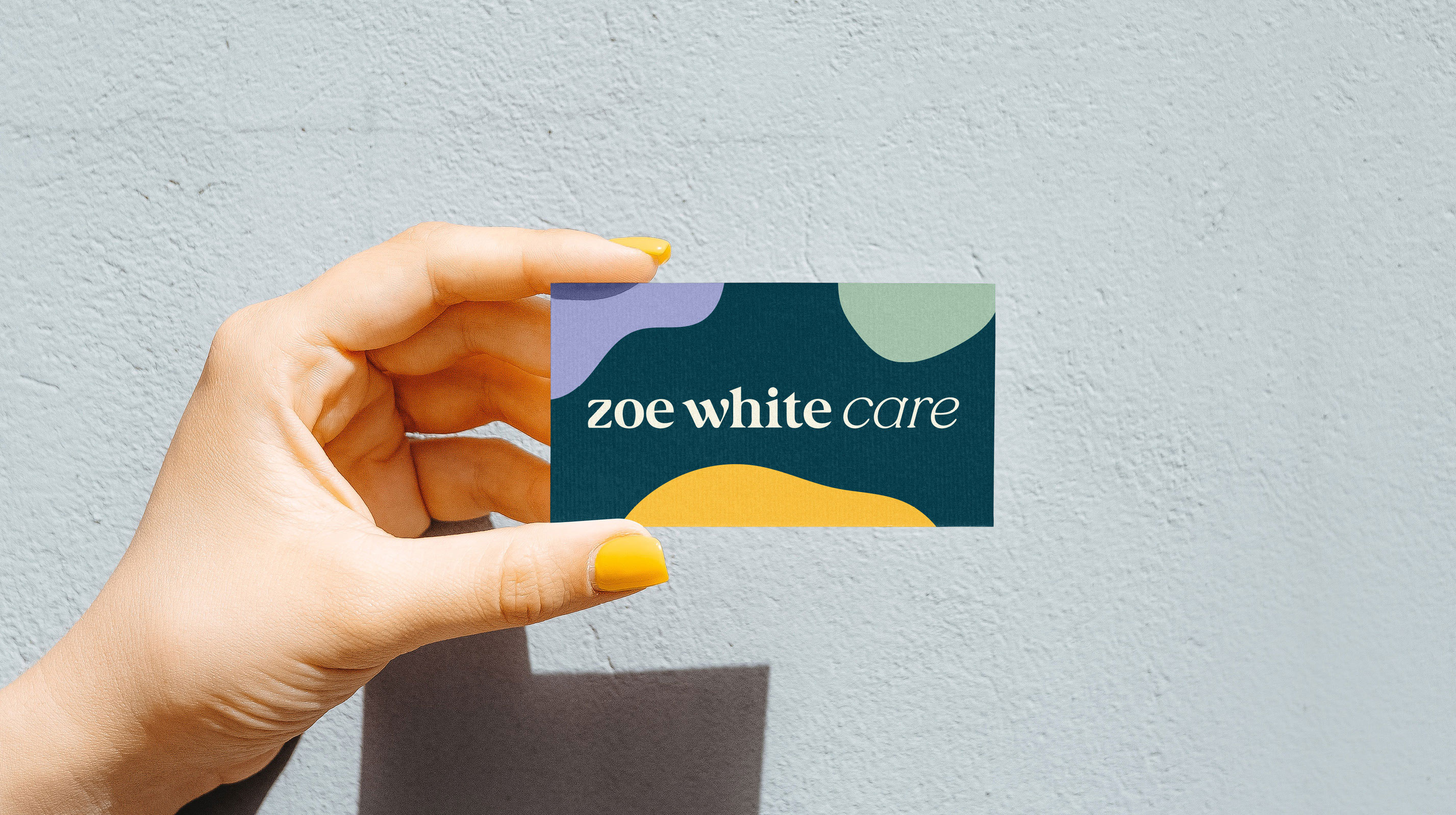
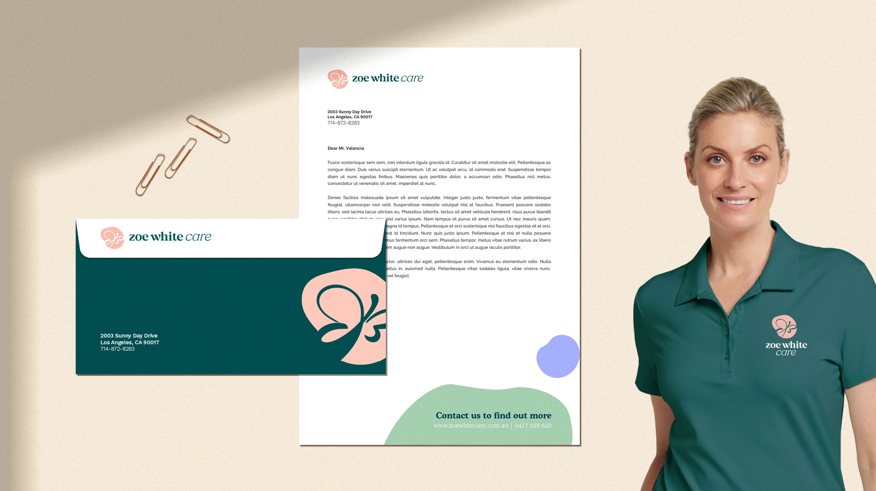
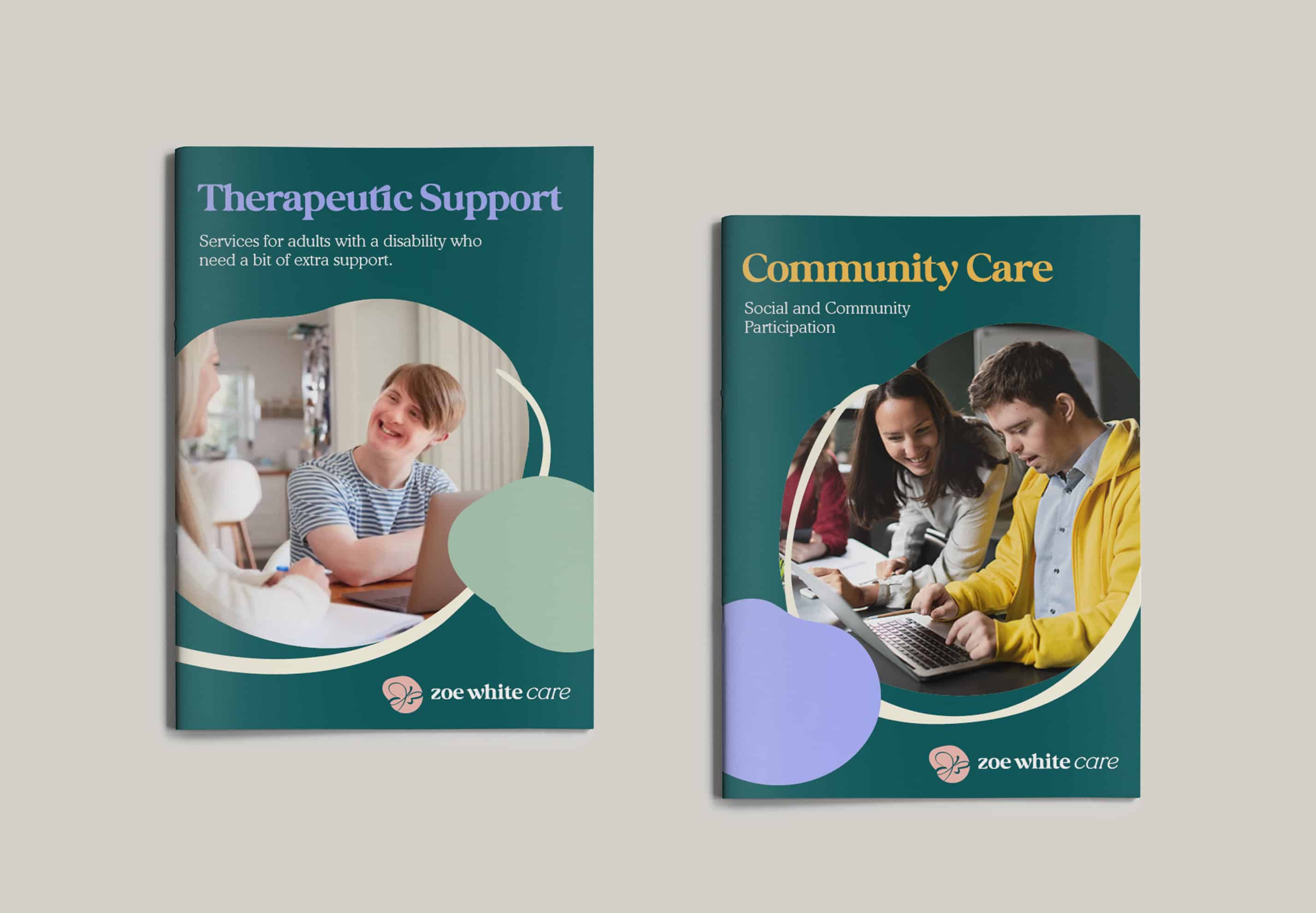
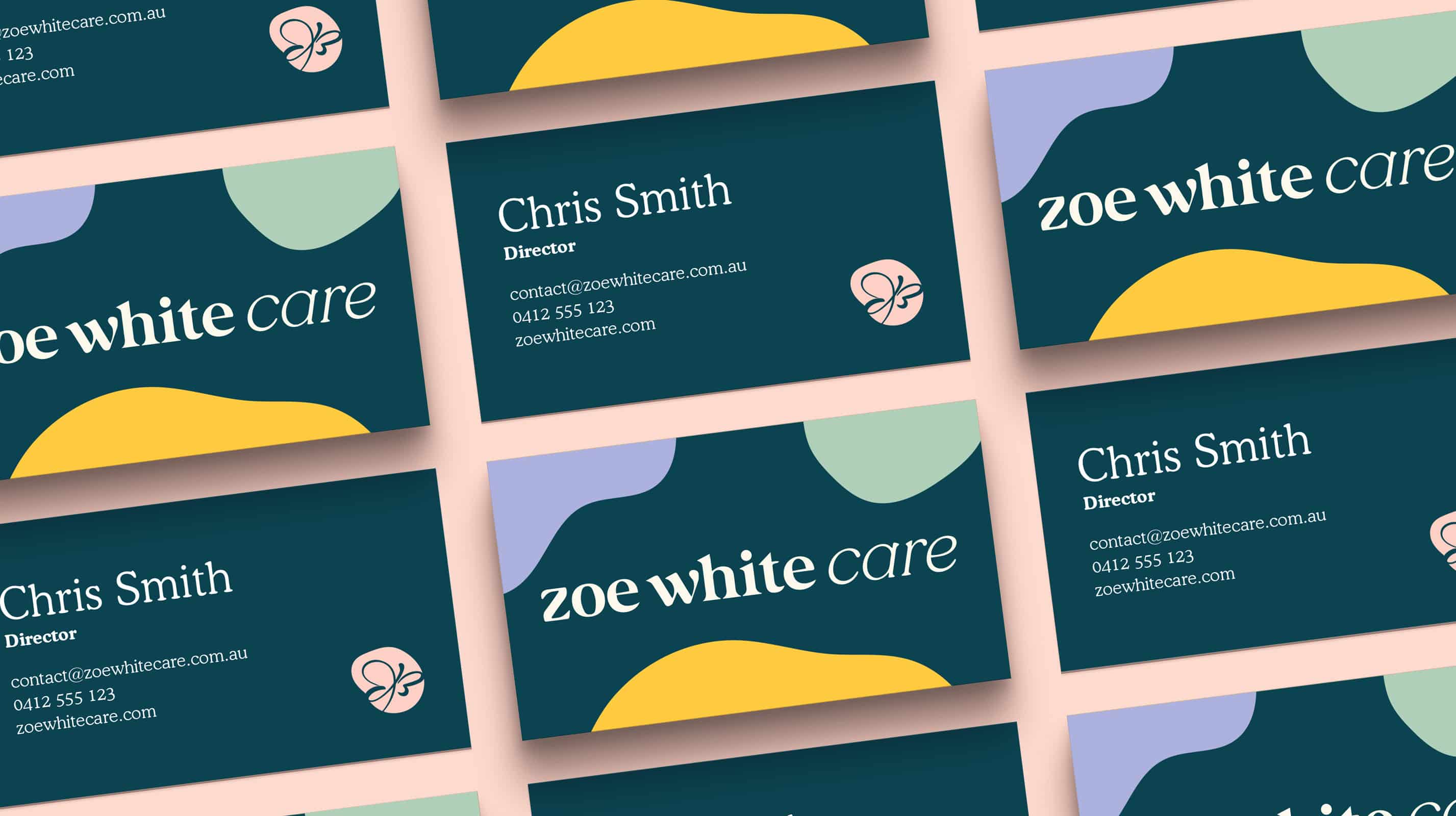
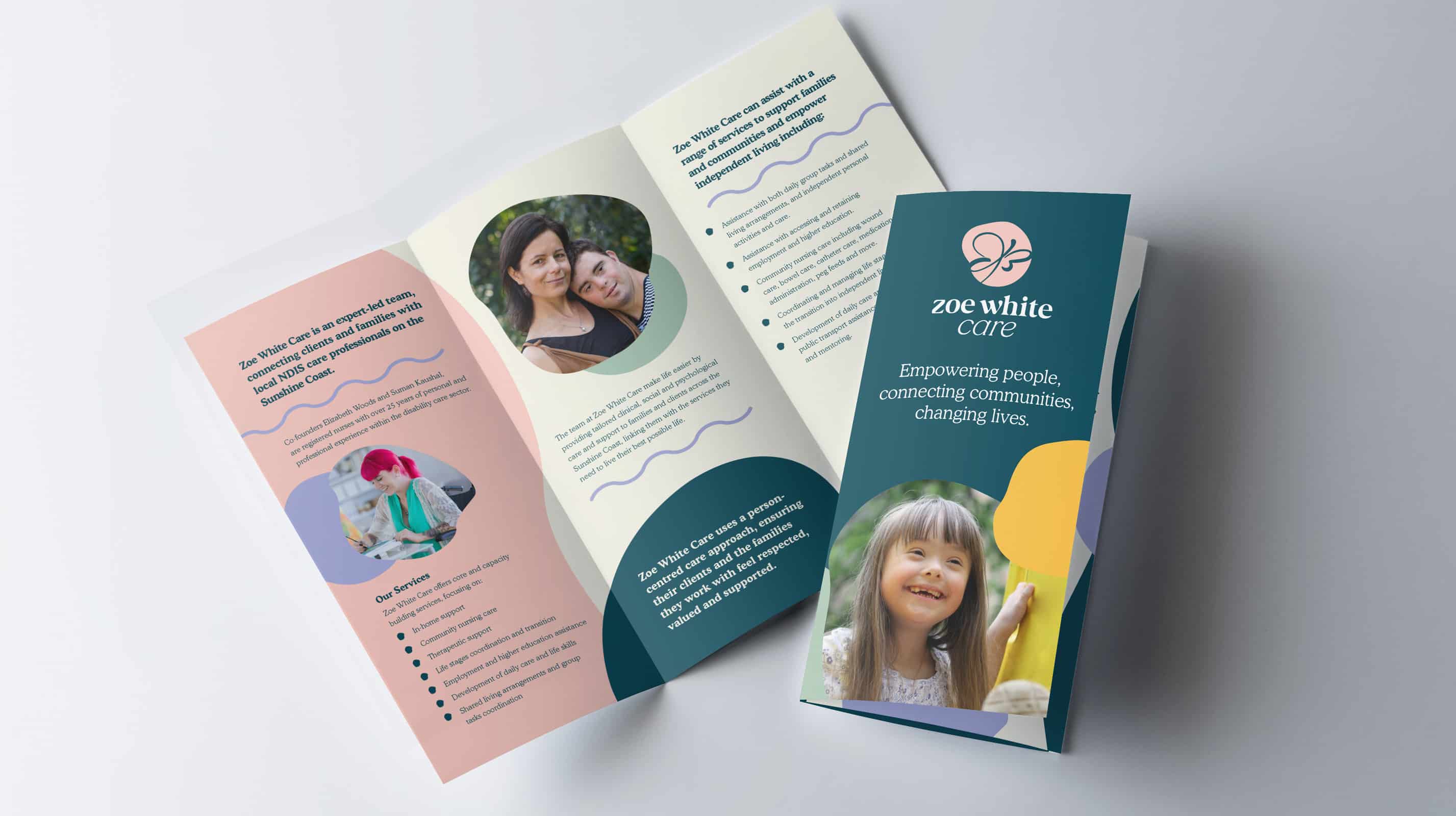
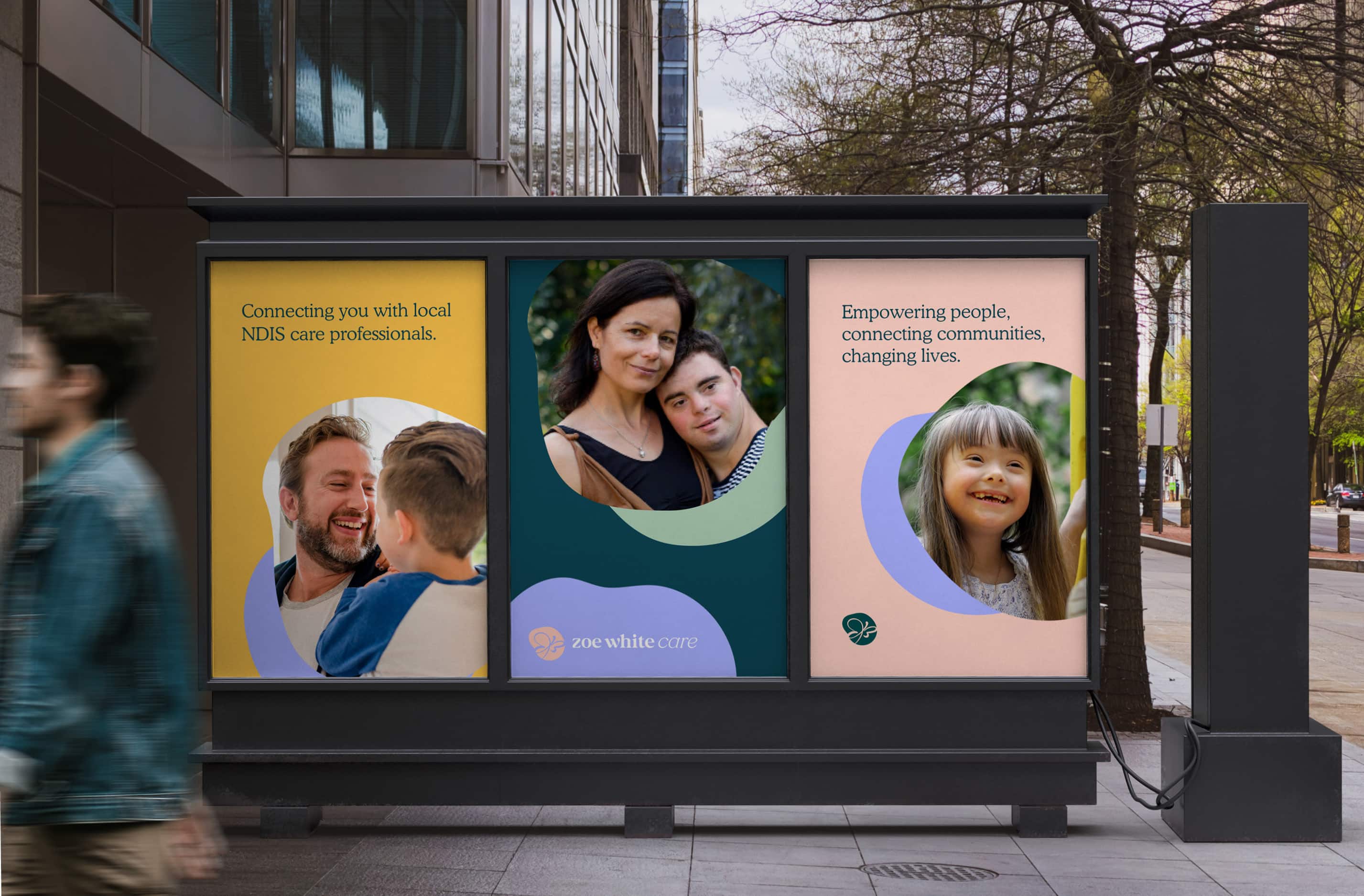
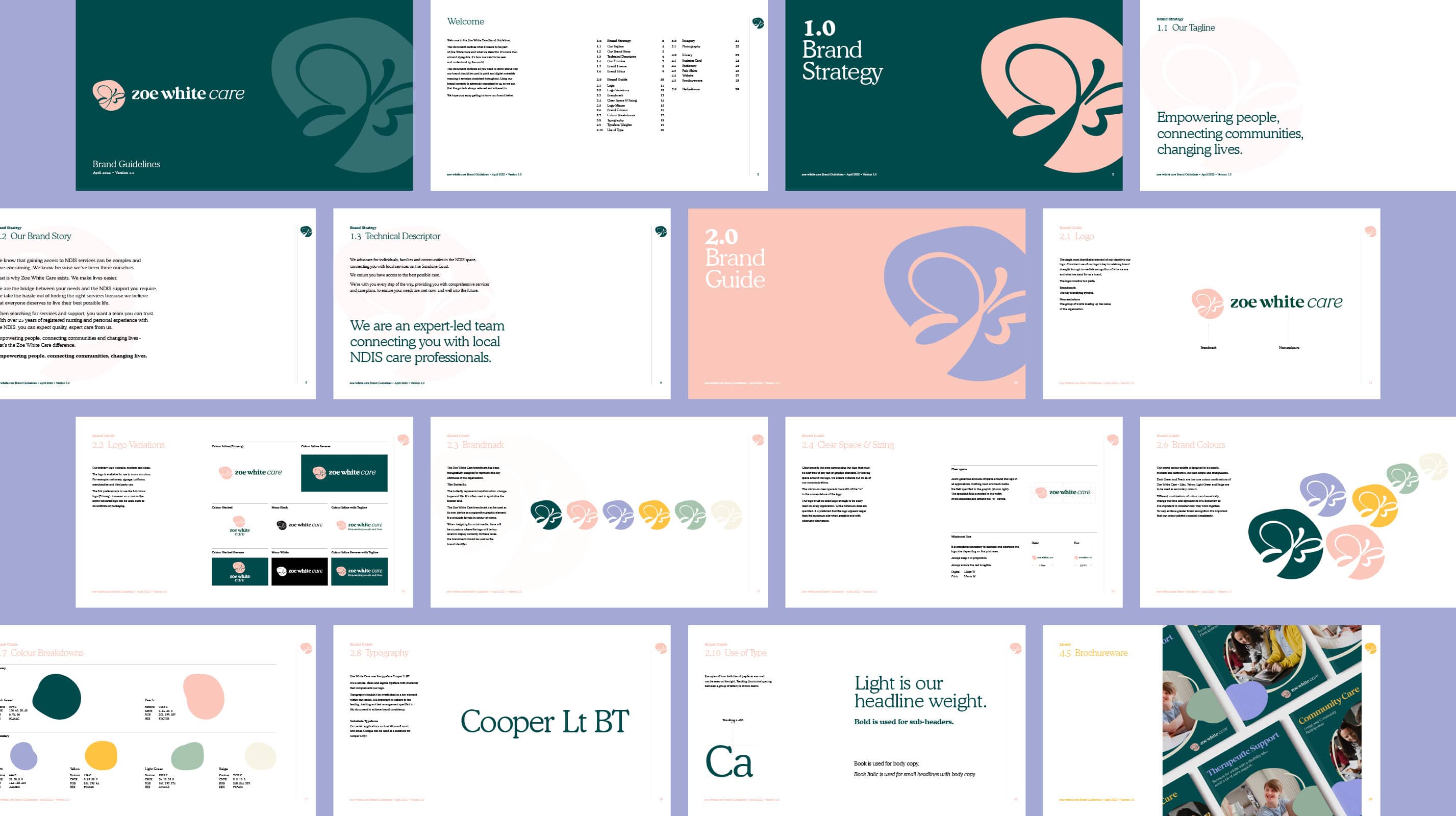
Working with the Zoe White Care team, SOAK was able to align the values of the company with the bran. This ensured that the new visual identity spoke to the team, as well as future participants, and felt comforting and supportive. Soft but bright colours were used to create the logo and visual assets which included shapes. The butterfly was chosen to represent the human soul, something the team at Zoe White Care were passionate about including.
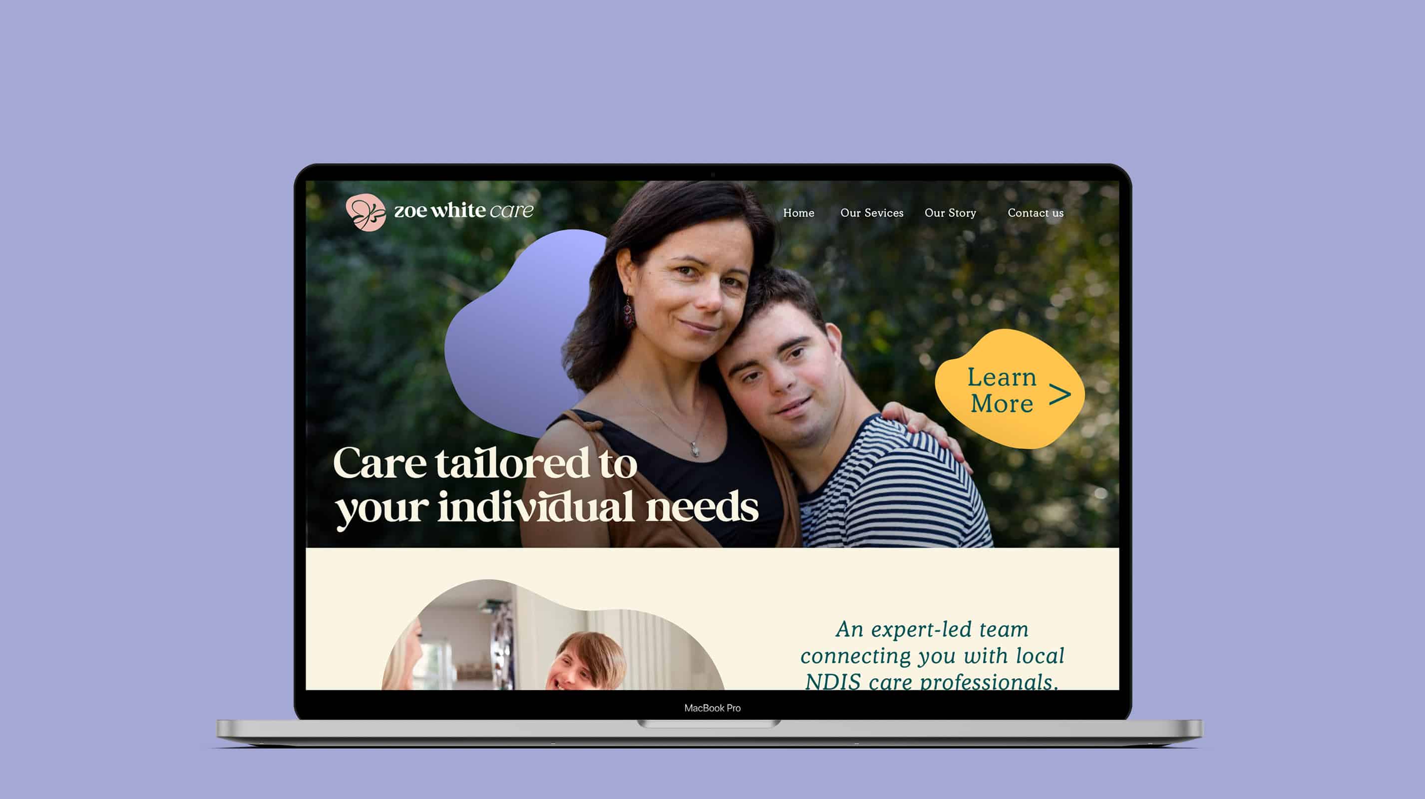
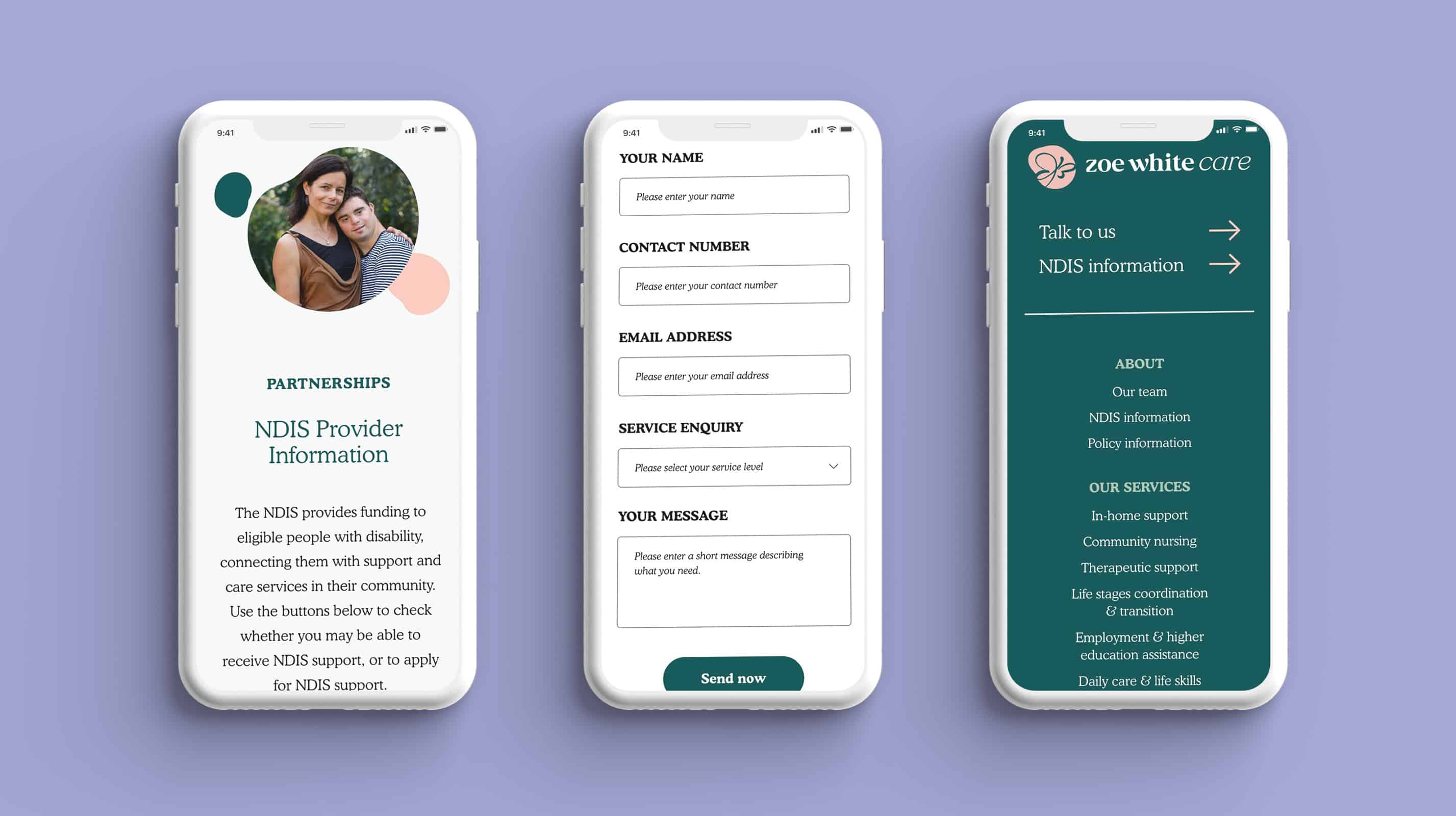
The website design and build were critical to Zoe White Care becoming a registered provider. Ensuring the website was easy to use and clear was important, with digital accessibility playing a key role in the design. the values of the company with the brand,
